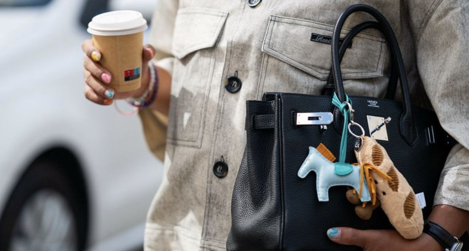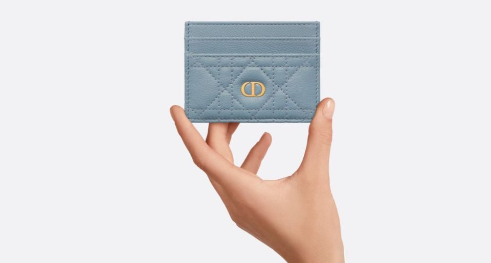
(Image credit: dior)
Contents
- Why Card Cases Are More Interesting Than They Look
- Louis Vuitton: When the Pattern Does All the Work
- The Monogram Doesn't Need a Handbag
- Monogram Empreinte Changes the Feeling
- Then You Can Personalize It
- Chanel: How Much Chanel Can Fit on Ten Centimeters of Leather?
- Quilting Is Almost a Logo by Itself
- Caviar-Like Grained Leather Makes Sense Here
- The CC Can Be Tiny and Still Be Enough
- Bottega Veneta: The Card Case That Doesn't Need to Tell You Its Name
- When Craftsmanship Becomes Branding
- Small Scale Makes You Notice the Leather More
- Dior: The Saddle Curve Is Enough
- You Don't Need the Whole Bag
- Dior Oblique Gives It Another Layer
- Hermès Calvi: What Happens When You Remove Almost Everything?
- The Leather Becomes the Main Event
- Color Is Almost the Branding
- Gucci: Sometimes the Logo Really Is the Design
- Small Accessories Are Perfect for Strong Branding
- A Card Case Can Carry an Entire Collaboration
- Sometimes I Actually Prefer the Smaller Piece
- Why Card Cases Became More Useful as Wallets Became Less Necessary
- The Smallest Luxury Purchase Can Get the Most Use
- And That Means Condition Matters
- Buying Second-Hand: Simple Doesn't Mean Easy to Authenticate
- Which Brand Does the Best Job?
- The Card Case Is Almost a Brand Test
A card case is probably one of the smallest things you can buy from a luxury fashion house. There isn't much space to work with. No dramatic handle. No chain strap. No interesting bag shape. No room for a giant pocket, lock or complicated closure. Most of the time, it's basically a small rectangle of leather or canvas designed to hold a few cards. And somehow, I can still look at one from across a display case and know exactly which brand made it.
That's what makes luxury card cases much more interesting than they seem. Shrink a Louis Vuitton bag down and the Monogram still tells you everything. Give Chanel a small piece of quilted leather and a CC, and you already know what you're looking at. Bottega Veneta doesn't even need a logo if the leather is woven in the right way. Dior can use one curve from the Saddle and suddenly a simple card holder feels connected to one of its most recognizable bags. Hermès can go in the opposite direction and remove almost everything. The leather, color and construction become the identity.
I think card cases are almost a test for a fashion house. Take away the size and spectacle. What's left? If the brand has really strong design codes, apparently quite a lot.
Why Card Cases Are More Interesting Than They Look
(Image credit: purse blog)
I'll admit that card cases aren't usually the first thing I think about when talking about iconic luxury design. Bags get all the attention. We know the Speedy. The Classic Flap. The Birkin. The Saddle. The Cassette. Those bags have histories, recognizable silhouettes and huge collector followings.
A card case doesn't have the same drama. But maybe that's why it's such a good way to look at branding. There isn't anywhere to hide. If you're designing something that measures around ten centimeters across, you have to decide what really makes your brand recognizable. Is it the logo? The material? A pattern? The stitching? A particular shape? The hardware? The color?
Luxury houses answer that question very differently. And I think the best card cases are the ones where the answer feels obvious.
Louis Vuitton: When the Pattern Does All the Work
(Image credit: fashion phile)
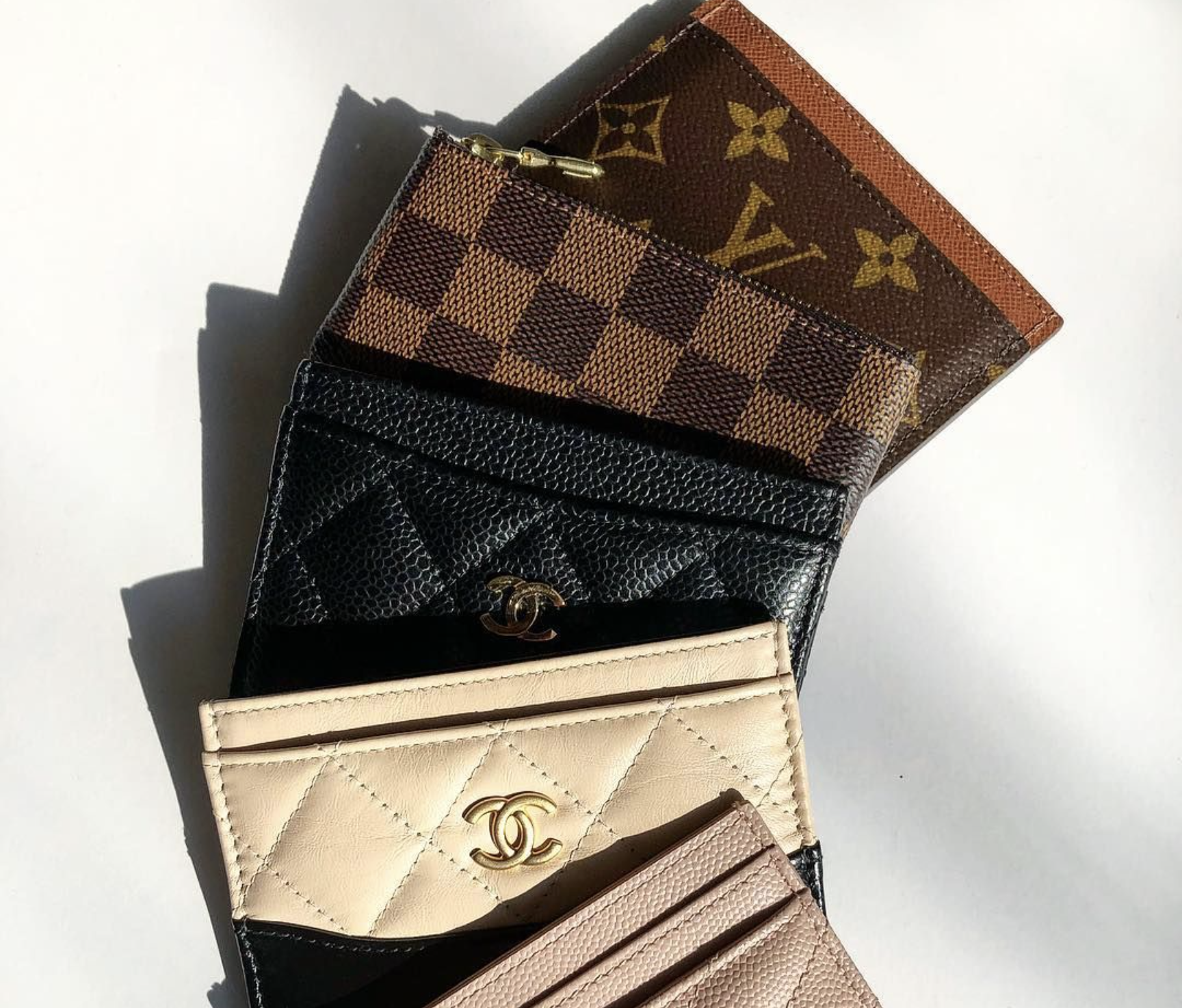
Louis Vuitton might have the easiest job here. Put Monogram canvas on a card holder and you're basically finished. That's not criticism. If anything, it shows how powerful the Monogram has become.
The current classic Louis Vuitton Card Holder is extremely simple. It has an interior slot, two outside card slots and the familiar Monogram canvas across the exterior. There isn't much else happening.
It doesn't need anything else. The pattern already carries more than a century of Louis Vuitton identity.
The Monogram Doesn't Need a Handbag
(Image credit: pinterest)
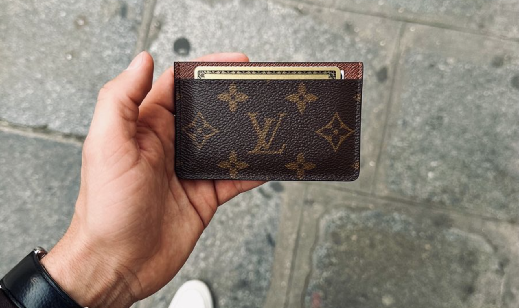
This is what I find fascinating about Louis Vuitton. The Monogram can survive almost any scale. Put it on a trunk. It works. A Speedy. It works. A Keepall. A wallet. A passport cover. A card case. You can show me a tiny section of brown coated canvas with an LV and one Monogram Flower and I already know what it is.
That's an incredibly strong visual identity.
And on something as small as a card case, the pattern becomes even more important because there isn't much room for another design element. The object doesn't need to imitate a famous Louis Vuitton handbag. It just needs the canvas.
Monogram Empreinte Changes the Feeling
(Image credit: louis vuitton)
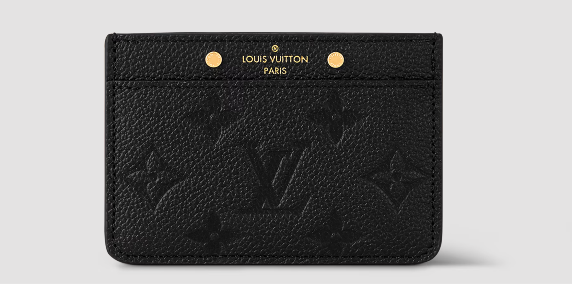
Then you have Monogram Empreinte. Instead of printing the familiar pattern across coated canvas, Louis Vuitton embosses it into grained leather. The current Empreinte Card Holder uses that embossed Monogram across supple cowhide leather.
Same basic symbols. Completely different feeling.
Personally, I think this is where card cases become really useful for understanding how materials affect branding. The traditional Monogram is obvious. Empreinte is quieter. You still recognize Louis Vuitton, but you notice the leather before you notice the contrast of the print. It's a small difference on paper, but in person it can make the accessory feel much more understated.
Then You Can Personalize It
(Image credit: louis vuitton)
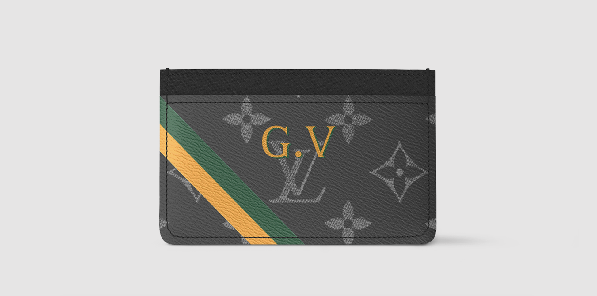
Louis Vuitton also offers Mon Monogram versions that allow customers to add initials and colored stripes to the classic canvas. I like this particularly on small leather goods.
On a large bag, personalization can become the main visual feature. On a card holder, it's more like a tiny signature. And because card cases are objects we use constantly, personalization actually makes sense here.
This isn't something sitting untouched on a shelf. You're pulling it out of your bag. Using it. Putting it back. It becomes a very personal everyday object.
Chanel: How Much Chanel Can Fit on Ten Centimeters of Leather?
(Image credit: chanel)
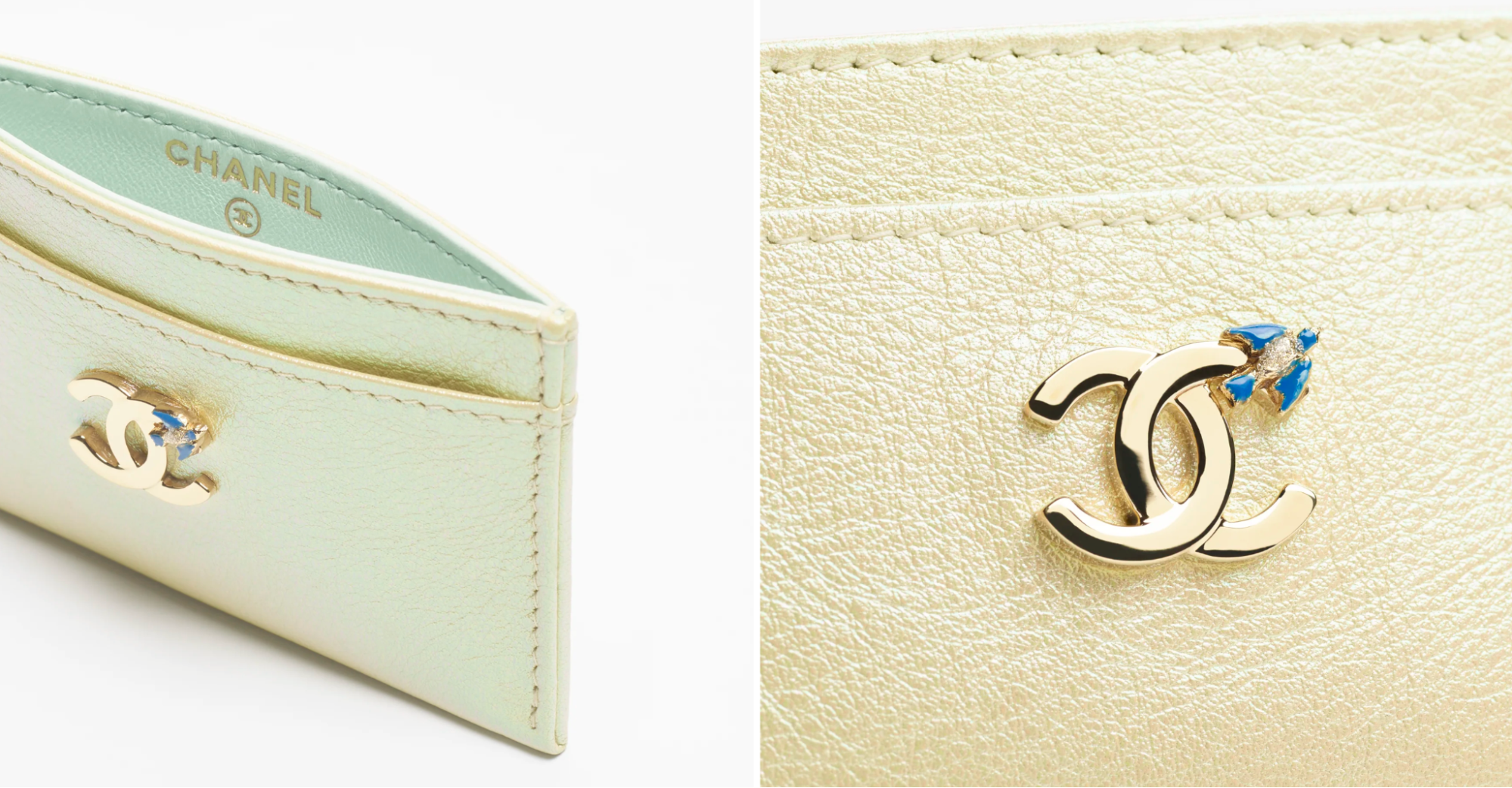
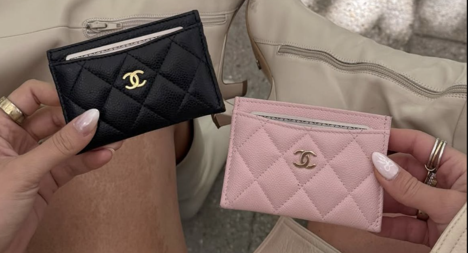
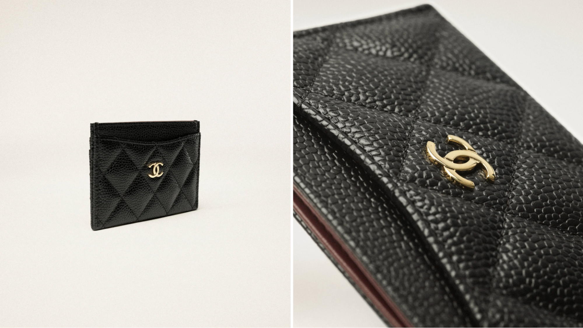
Quite a lot, apparently. Chanel is interesting because it has several codes that work extremely well at small scale. Quilting. The double C. Chain-inspired details on some designs. Black leather. Gold-tone hardware. Even if you remove most of those elements and keep only one or two, the result can still look immediately Chanel.
The current Classic Card Holder is a good example. Chanel offers the style in grained calfskin with gold-tone metal, and the proportions are incredibly simple. Yet you don't look at it and think, "generic black card holder." You think Chanel.
Quilting Is Almost a Logo by Itself
(Image credit: pinterest)
This is where I think Chanel has an advantage. The house doesn't always need to rely completely on the CC. The quilting can do some of the work.
Diamond quilting has become so connected to Chanel bags that seeing it on a small leather object immediately brings the larger handbags to mind. That's clever because the card case starts borrowing the identity of the bag without actually copying its silhouette.
You're not carrying a miniature Classic Flap. But visually, there's a relationship. And I think that's why Chanel small leather goods can feel satisfying to someone who already loves the bags. The design language carries over.
Caviar-Like Grained Leather Makes Sense Here
(Image credit: pinterest)
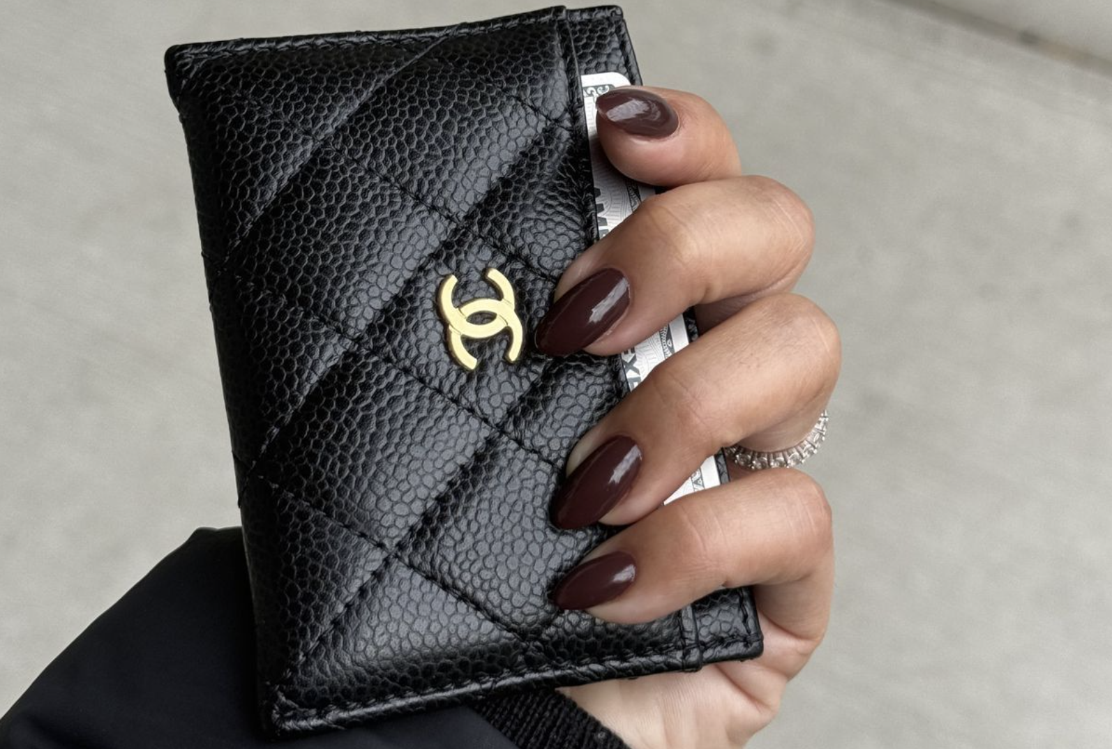
I'm also drawn to the grained versions for practical reasons. A card holder gets handled constantly. Probably more than some handbags. You touch it every time you pay for something. It rubs against keys, makeup and whatever else is inside your bag. It gets pushed into pockets. It gets dropped onto tables.
A beautiful delicate leather can look amazing when it's new, but a card case has a pretty hard life. That's why I understand the appeal of Chanel's grained calfskin for this category. It still gives you the Chanel look without making me nervous every time I use it.
The CC Can Be Tiny and Still Be Enough
(Image credit: pinterest)
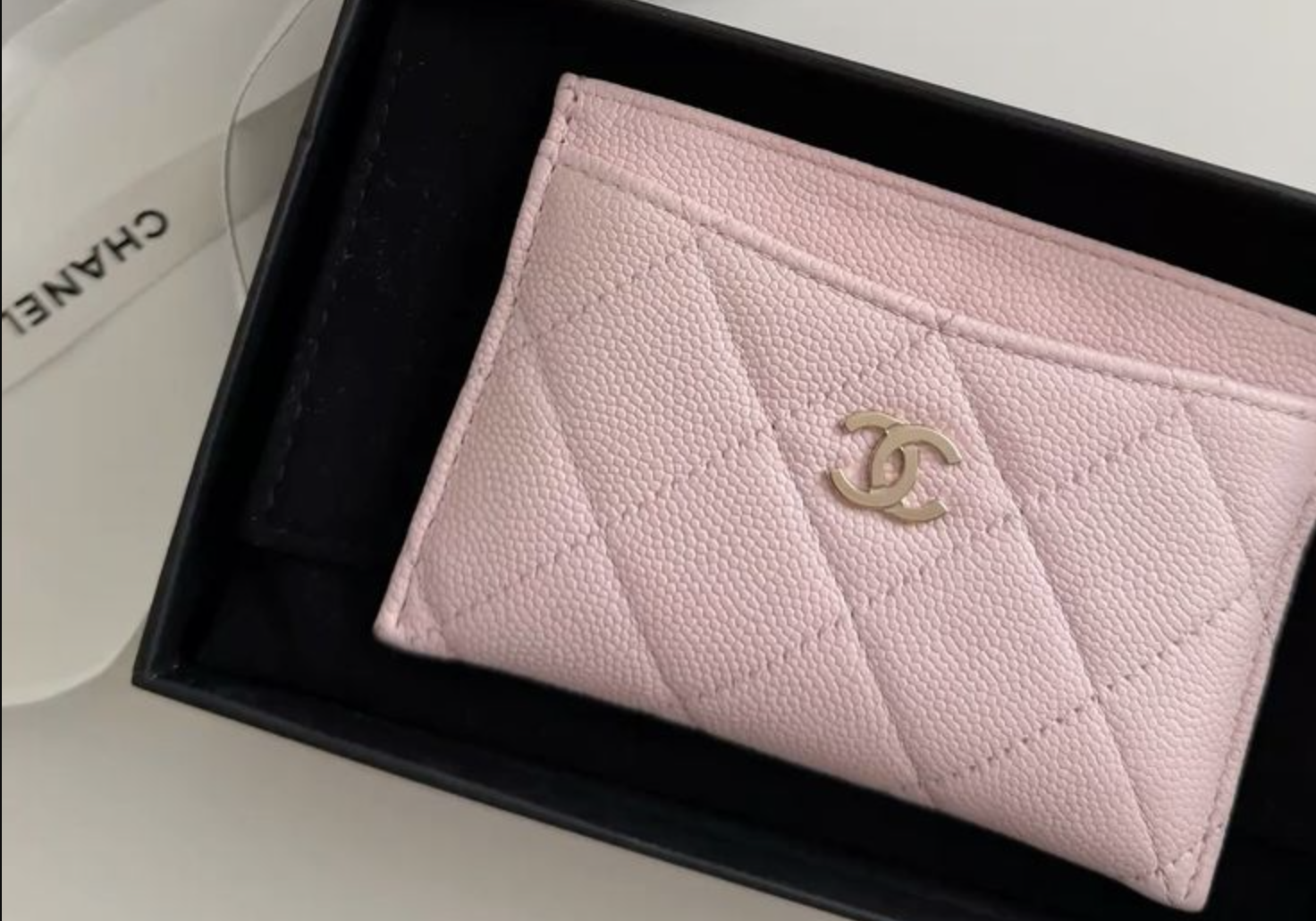
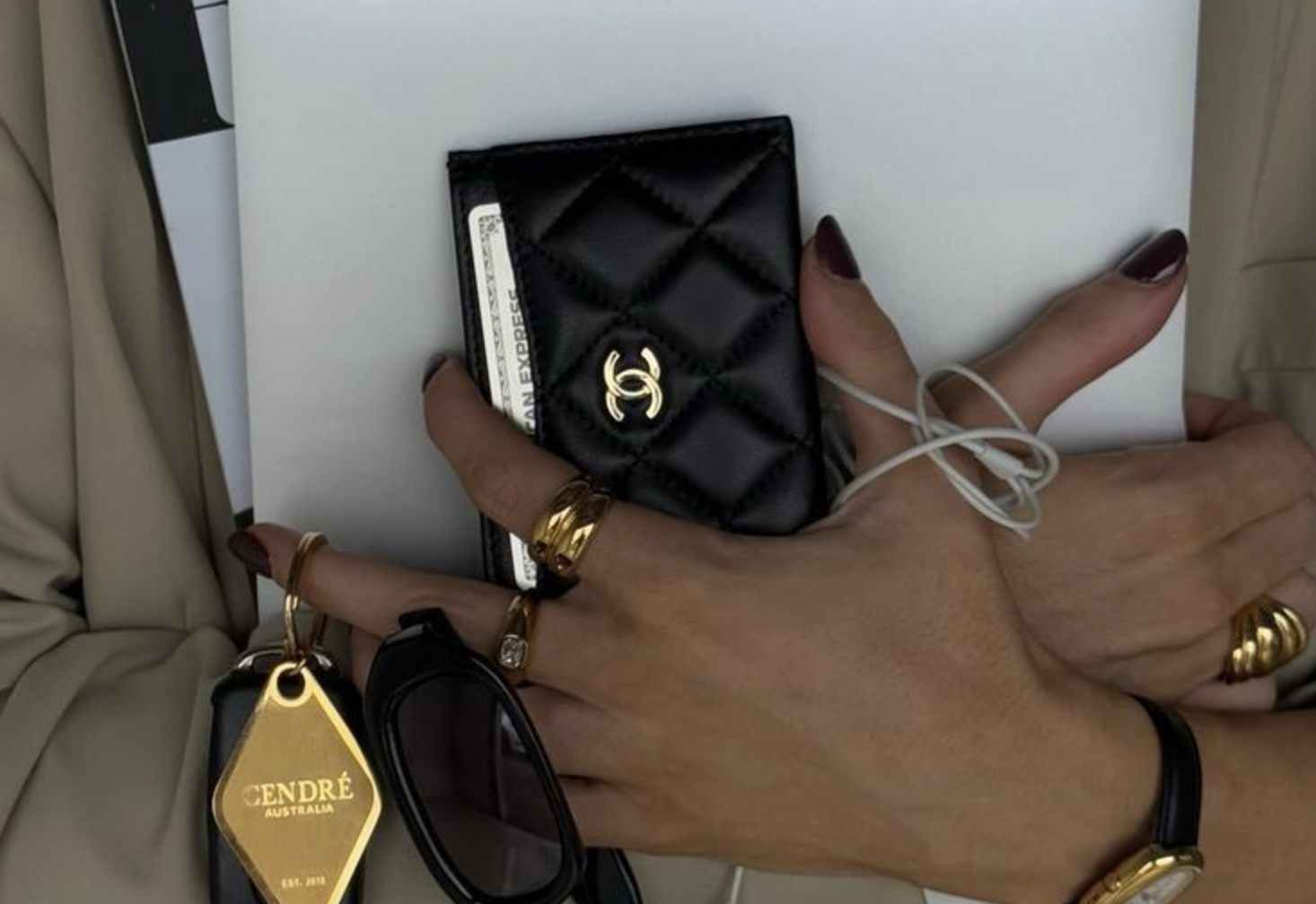
The double C is another perfect example of scale not really mattering. It doesn't need to be huge. A small metal CC on the front immediately changes the object. This is probably where people divide into two groups. Some want the logo. Others think it's too obvious.
Personally, if I'm buying something this small from Chanel, I don't mind the CC. The whole point for me is that you're taking the house's identity and compressing it into a tiny accessory. Let it look like Chanel.
Bottega Veneta: The Card Case That Doesn't Need to Tell You Its Name
(Image credit: neimanmarcus)
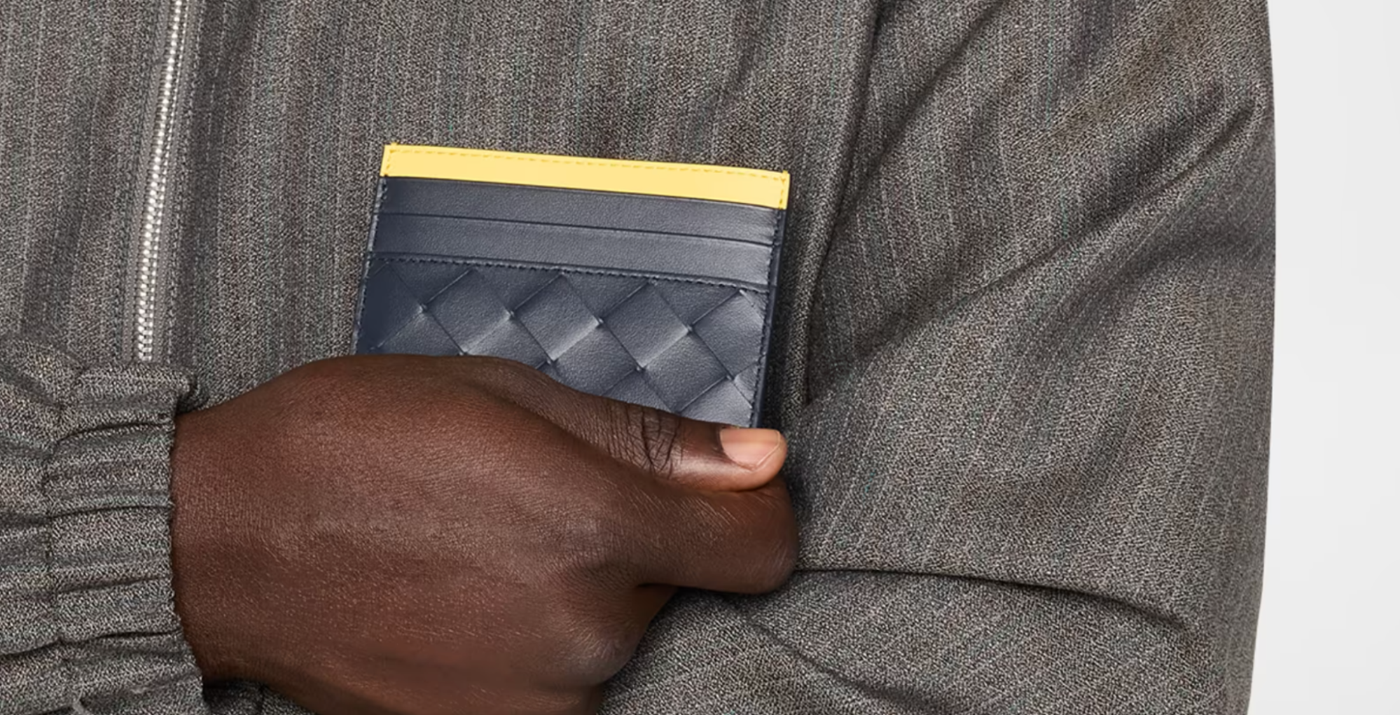
Bottega Veneta might be my favorite example for this topic because the house can remove the obvious logo completely and still be recognizable. That's difficult. The reason is Intrecciato.
The woven leather technique has become so connected to Bottega Veneta that it functions almost like branding. You don't need BOTTEGA VENETA written across the front. The leather already tells you. And I think that's one of the strongest things a fashion house can achieve.
When Craftsmanship Becomes Branding
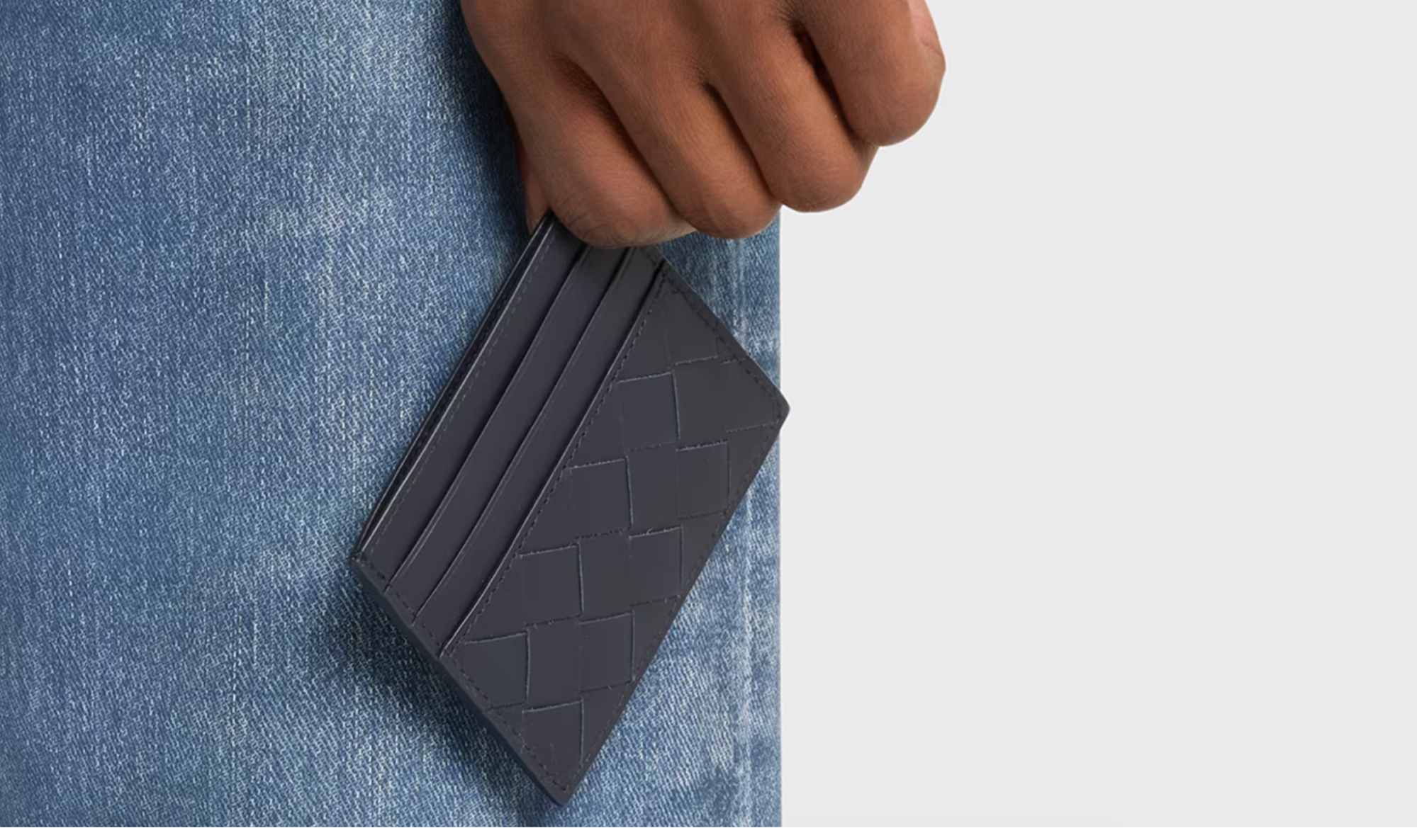
(Image credit: neimanmarcus)
Most brands create a symbol and put it on the product.
Bottega can use construction as the symbol. That's much more interesting to me. You recognize the way the leather is worked rather than a piece of hardware attached afterward. It also means a tiny card case can communicate the same identity as a much larger bag. The scale changes. The technique doesn't.
That's really the theme of this entire category.
A good card case doesn't need to recreate the handbag. It only needs to preserve the part of the design language that matters most. For Bottega, that's often the weave.
Small Scale Makes You Notice the Leather More
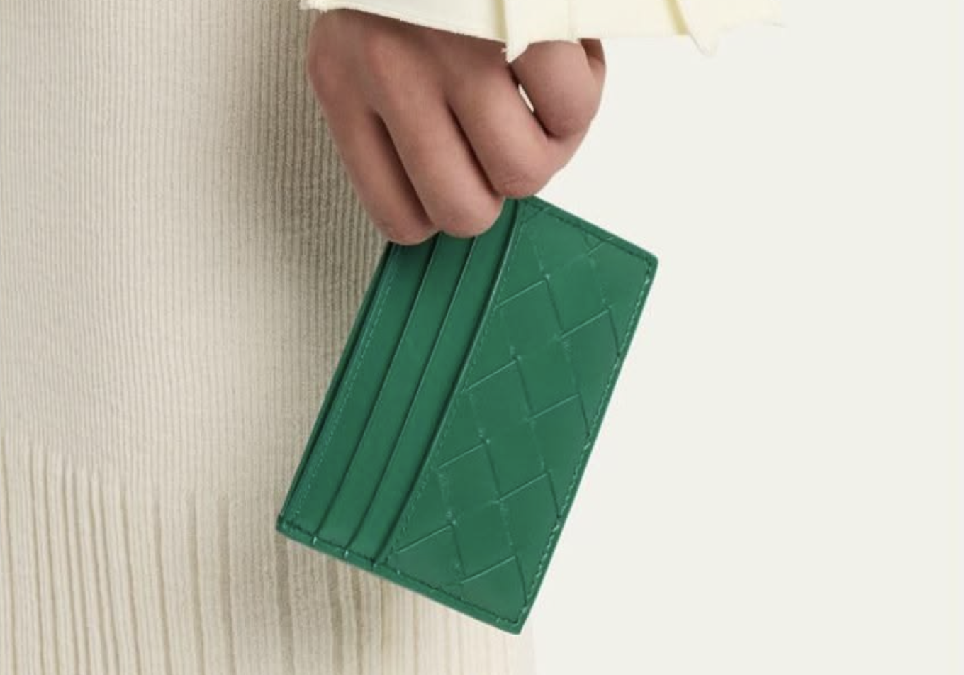
(Image credit: pinterest)
I also think Intrecciato becomes particularly interesting on small leather goods because you're forced to look closely. On a large bag, the woven surface becomes the entire visual effect. On a card holder, you start noticing the individual strips. The edges. How they meet. How the leather sits around the card slots.
There's something satisfying about seeing a technique associated with large luxury bags compressed into such a small object. It makes the card case feel less like a cheaper accessory and more like a miniature demonstration of the house's leather identity.
Dior: The Saddle Curve Is Enough
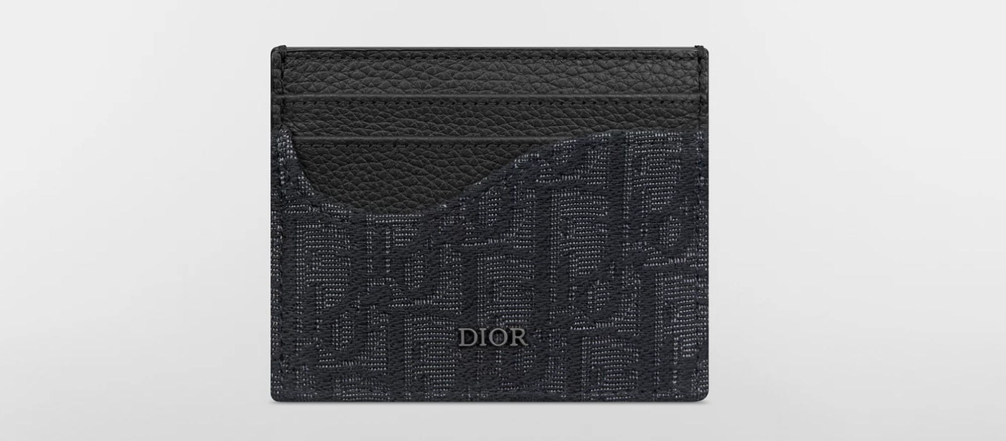
(Image credit: dior)
Dior takes a completely different approach with its Saddle card holders. The Saddle bag is so recognizable because of its unusual shape. It's curved. Asymmetrical. Immediately identifiable. Obviously, you can't turn every card holder into a full Saddle bag. It would be incredibly impractical.
So Dior takes the part of the silhouette people recognize and uses that.
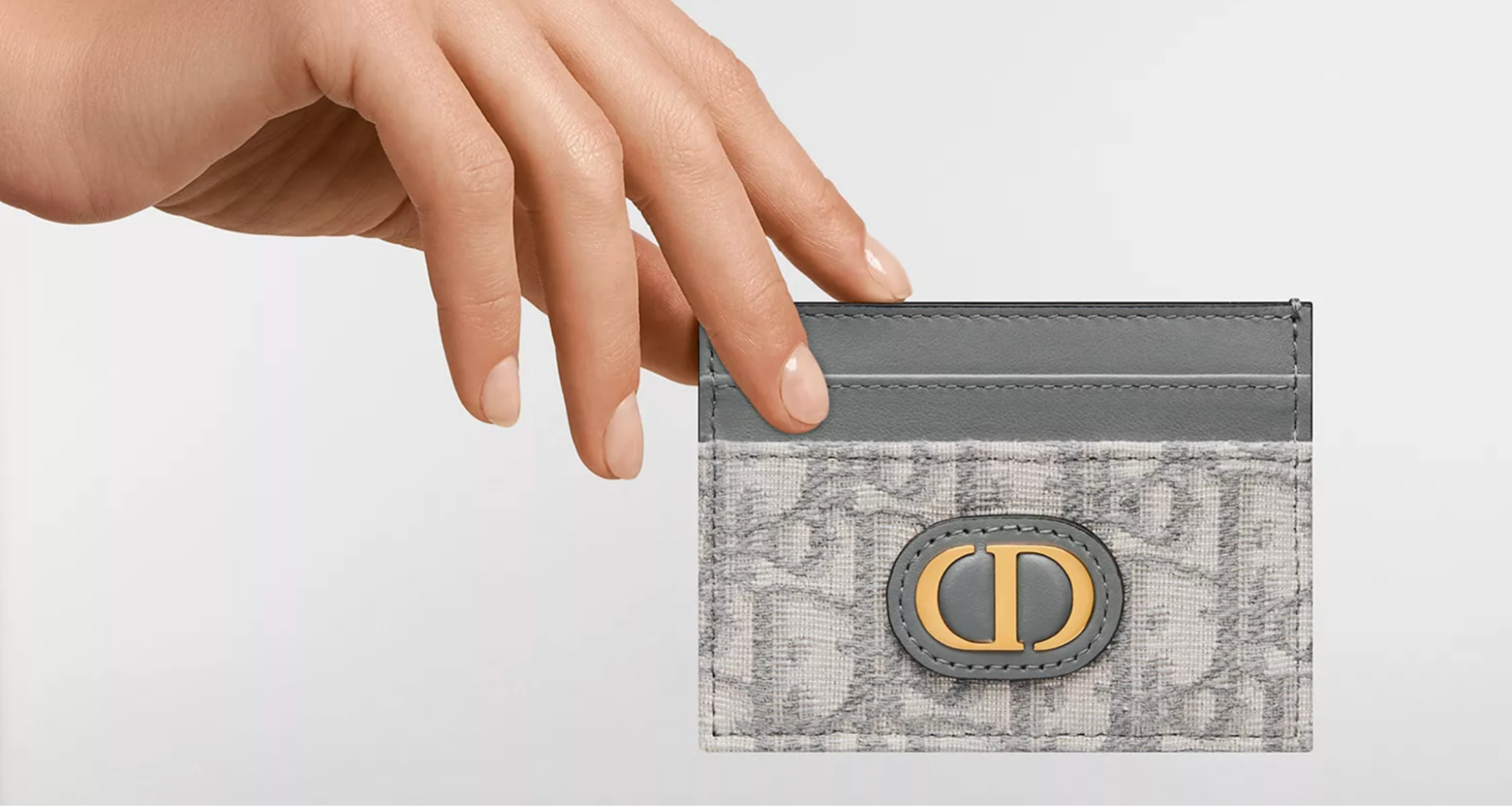
The house currently offers Saddle card holders where leather marquetry and Dior Oblique emphasize the Saddle lines, while its magnetic versions use the characteristic Saddle curve around the card slot.
That's such a smart way of shrinking a design.
You Don't Need the Whole Bag
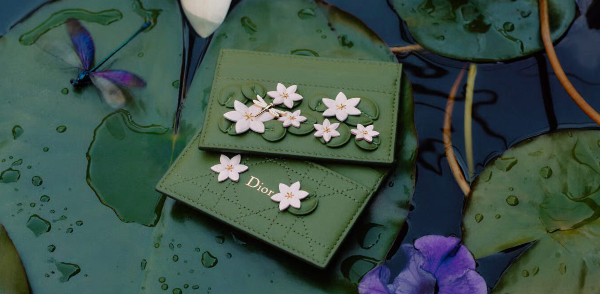
(Image credit: purseblog)
This is probably one of my favorite examples of how our brains recognize fashion. You don't need to see the complete Saddle silhouette. One curve can be enough. That's when you know a design has become iconic.
Think about how we recognize certain cars from their headlights. Or sneakers from the shape of one panel. Luxury fashion works the same way.
Once a visual detail becomes familiar enough, designers can isolate it and we still understand the reference. Dior can take the Saddle's curve, put it on a tiny card holder, and your brain completes the rest.
Dior Oblique Gives It Another Layer
(Image credit: dior)
Then Dior can add Oblique. Now you have two separate Dior codes on one very small object. The Saddle shape. The Oblique pattern. You almost don't need the Dior name at all.
And that's exactly what I mean by big design in a tiny package.
There isn't much physical space. But there can be a huge amount of brand history inside it. Personally, I'd probably choose a Saddle card holder where the curve is obvious. If I'm choosing the Saddle version, I want to see the Saddle. Otherwise, I'd rather choose a completely different Dior card case.
Hermès Calvi: What Happens When You Remove Almost Everything?
(Image credit: hermes)
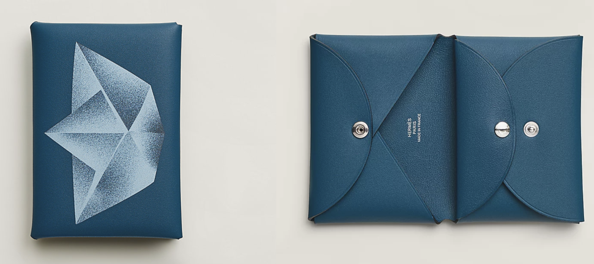
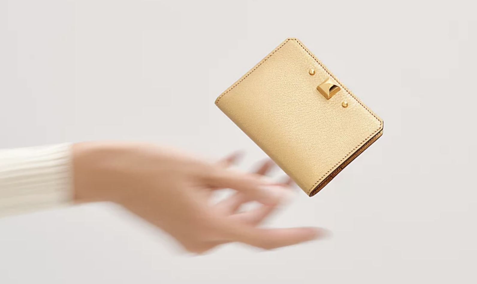
Hermès makes this article more interesting because the Calvi basically does the opposite of Louis Vuitton, Chanel and Dior. It doesn't need an obvious pattern. It doesn't need a giant H. It doesn't need to look like a miniature Birkin. The classic Calvi is almost aggressively simple.
Hermès describes it as a symmetrical card holder created through an interplay of leather folds, finished with a snap closure and two card compartments. It takes its name from the Corsican town of Calvi.
That's basically it.
And yet people who know Hermès small leather goods know exactly what they're looking at.
The Leather Becomes the Main Event
(Image credit: hermes)
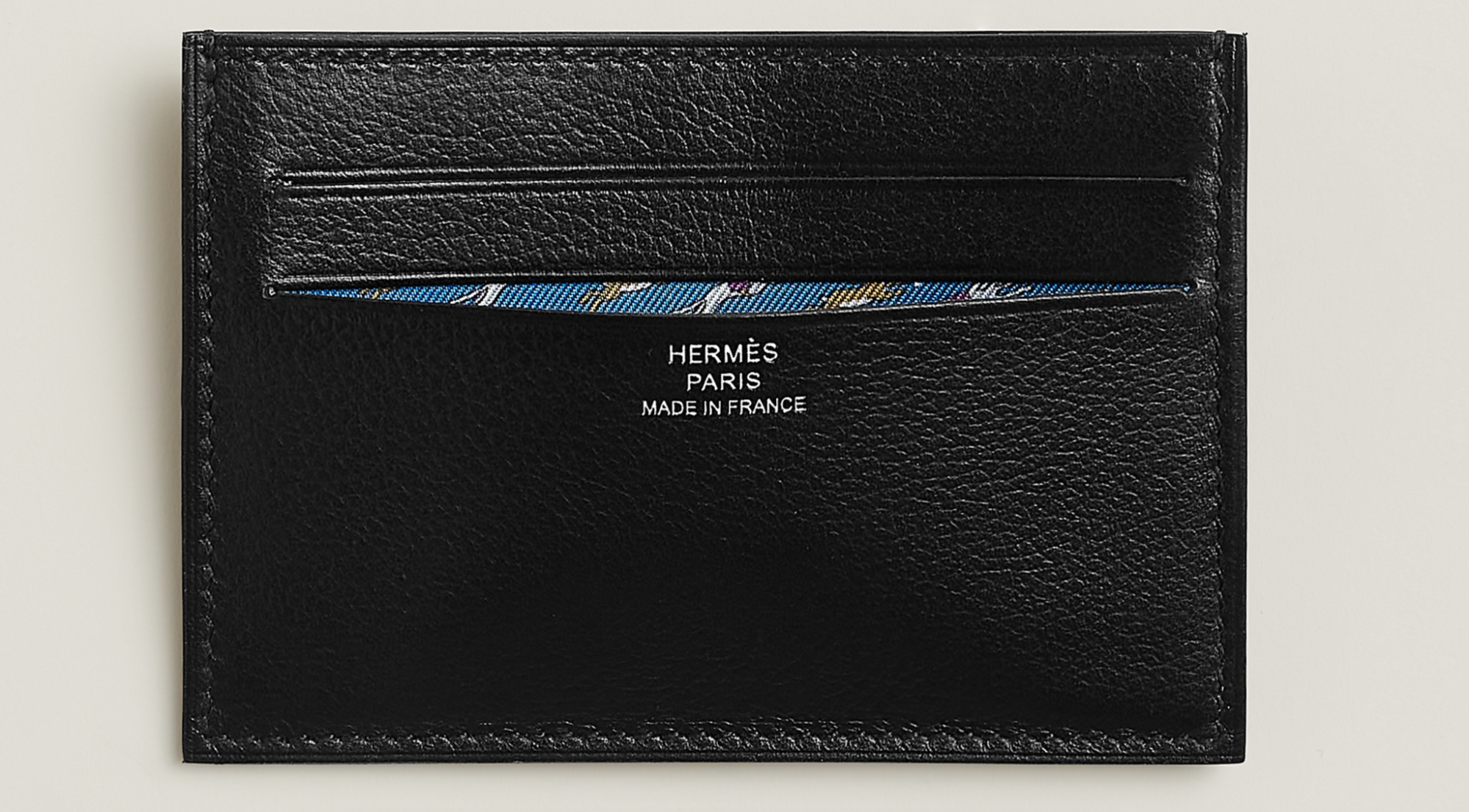
When you remove the logos and decorative hardware, there's nowhere for mediocre leather to hide. That's what I like about the Calvi. You start thinking about the material. Epsom. Box. Mysore. The color. The grain. The way the leather will age.
Hermès currently produces the Calvi in different leathers, including Epsom calfskin, Mysore goatskin and Box calfskin. And those choices actually matter.
Epsom has a small, regular grain and keeps its shape well. Hermès describes it as scratch-resistant, although the grain can fade in areas that receive a lot of rubbing. Mysore goatskin has a more natural-looking grain and becomes softer and more satiny with use. Box calfskin is smoother, glossier and more delicate, developing patina over time.
Same card holder. Very different personality.
Color Is Almost the Branding
(Image credit: hermes)
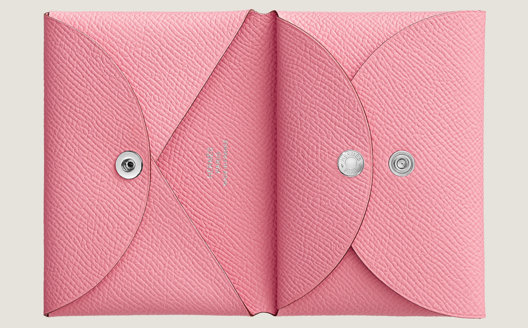
This is where Hermès gets me. I could spend much too long choosing a Calvi color. Rose Sakura. Gold. Rouge H. Étoupe. Noir. Bleu Électrique. The design is so simple that color becomes incredibly important.
A bright Hermès color on a tiny leather object can be enough. And unlike a Birkin or Kelly, choosing a wild color for a card case feels much easier. Maybe I don't want an entire bag in bright pink. A tiny Rose Sakura Calvi? That's different.
Small leather goods let you play with colors you might never choose for a major handbag purchase. I think that's one of their biggest appeals.
Gucci: Sometimes the Logo Really Is the Design
(Image credit: purseblog)
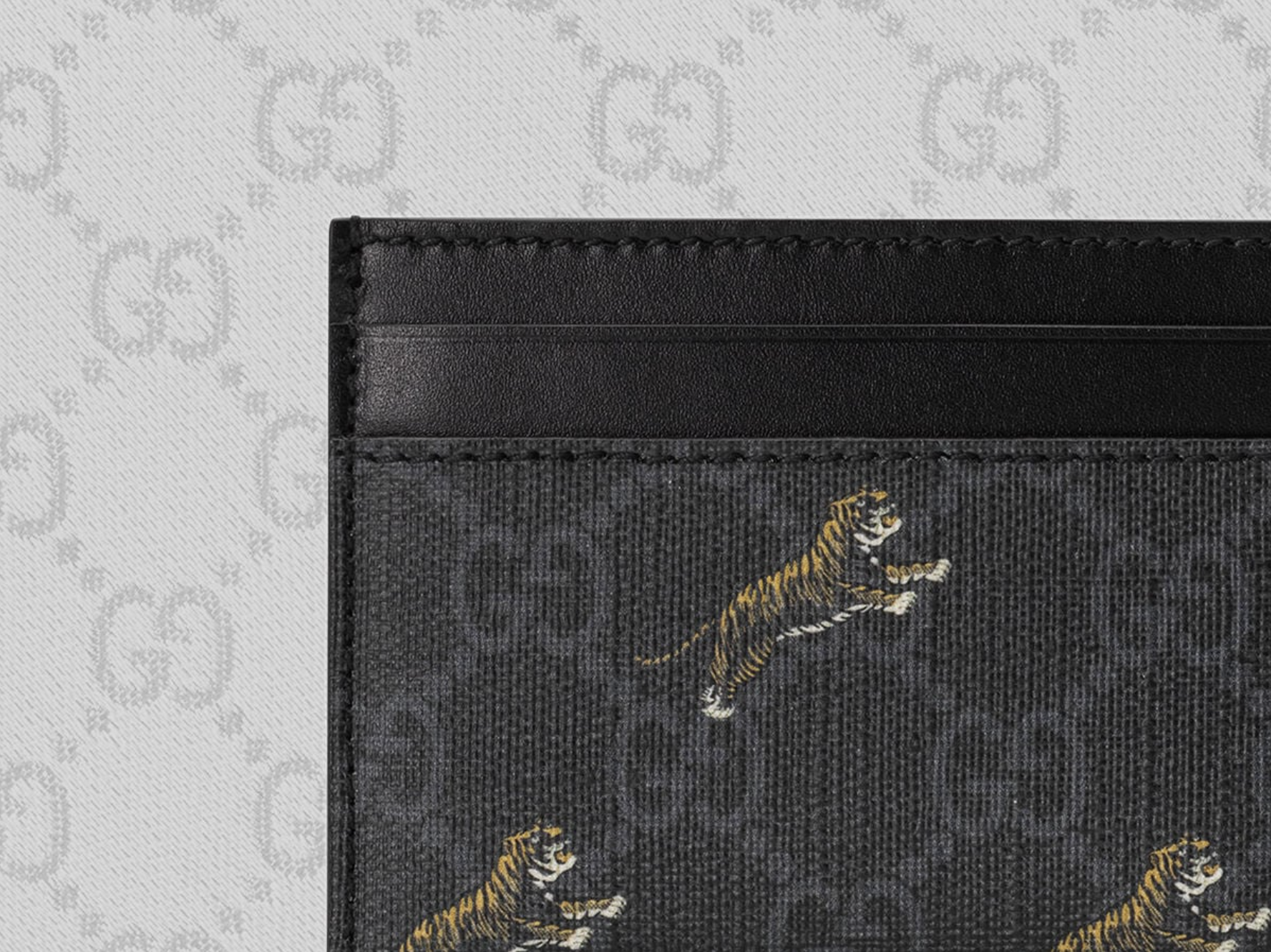
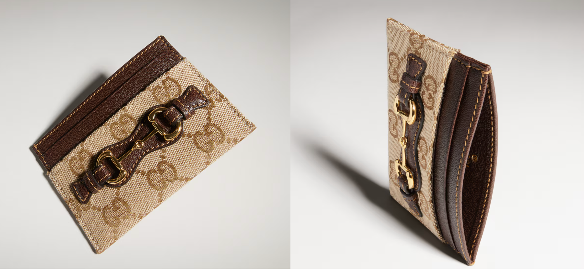
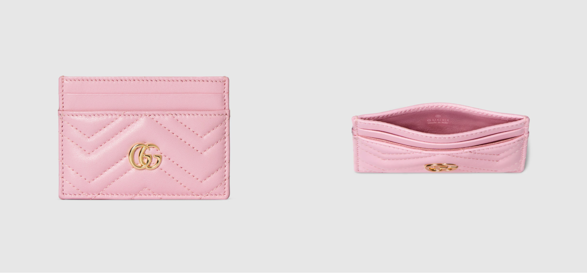
Not every brand needs to avoid obvious branding. Gucci is one of those houses where I think the logo can be part of the fun. GG canvas. The Double G. Web stripes. Horsebit.
Gucci has accumulated so many recognizable codes that its card cases can go in completely different directions while still looking like Gucci. And this is an important difference from something like Bottega.
Bottega's identity can come through technique. Gucci's often comes through symbols. Neither approach is automatically better. They're just different ways of making something recognizable.
Small Accessories Are Perfect for Strong Branding
(Image credit: gucci)
I actually think bold logos can make more sense on card holders than on large bags. A huge all-over logo bag can dominate an outfit.
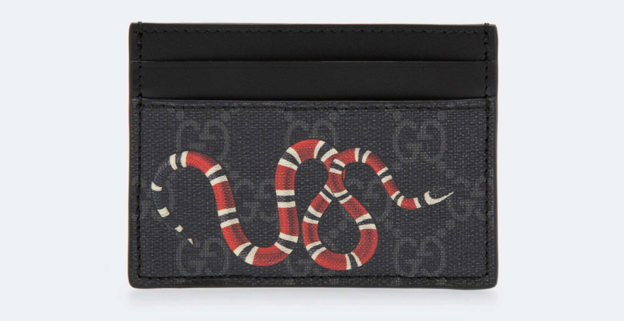
A tiny GG card case is different. You see it for a few seconds when someone takes it out. Then it disappears back into the bag. That gives you room to choose something louder. The same applies to color. Metallic leather. Bright prints. Seasonal motifs. Collaborations.
A card case can be the place where you buy the slightly ridiculous version of a brand you wouldn't commit to on a full-size bag. And personally, I think that's much more fun than always buying the safest black option.
A Card Case Can Carry an Entire Collaboration
(Image credit: louis vuitton)
This is where small leather goods become especially interesting to me from a second-hand perspective.
Think about limited editions and collaborations.
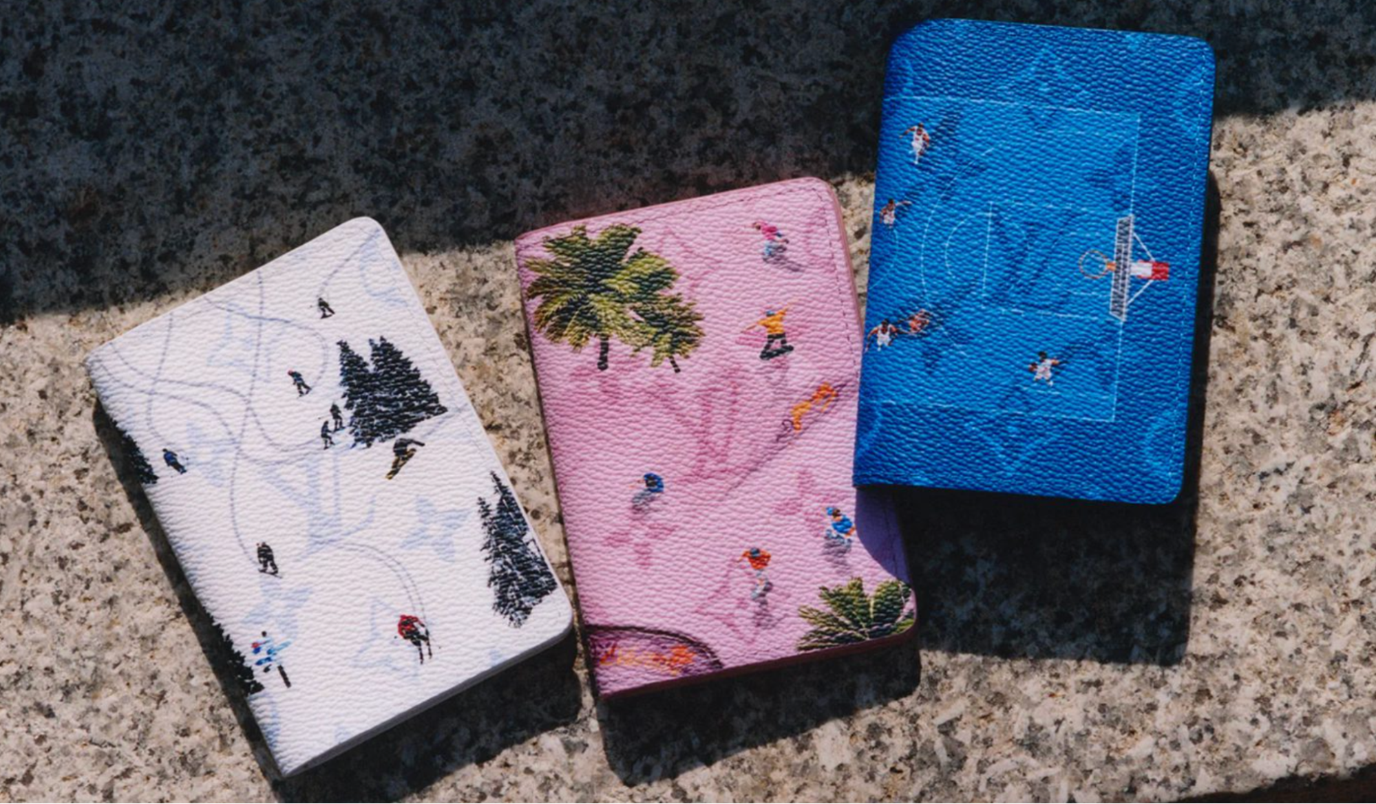
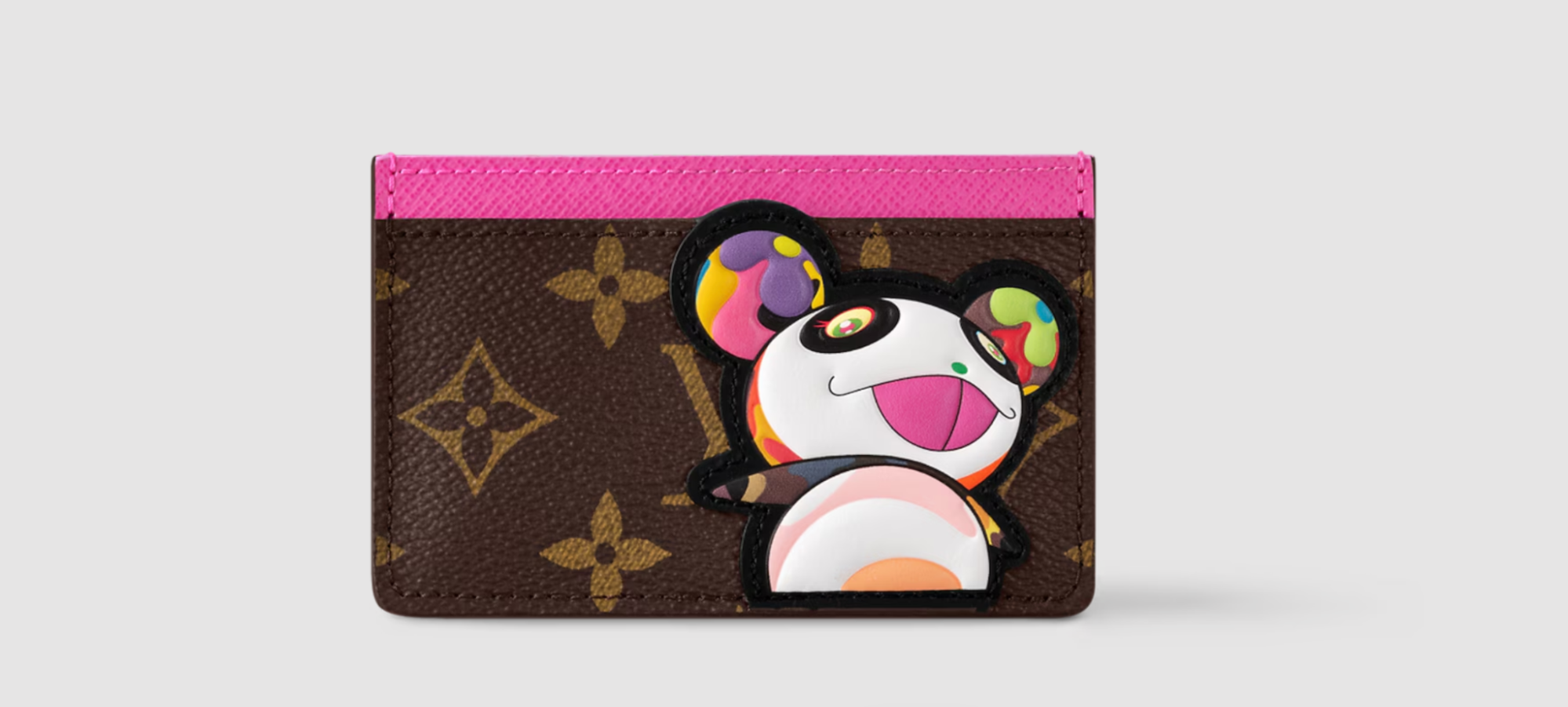
A major collaboration might produce a Speedy, Keepall, Neverfull, clothing, shoes and small leather goods. Years later, the bags can become expensive. Sometimes very expensive. But the card holders and wallets still carry the same artwork.
That's important.
If the thing you love about a collaboration is the print rather than the bag shape, you don't necessarily need the largest piece. A card case can preserve the exact visual idea.
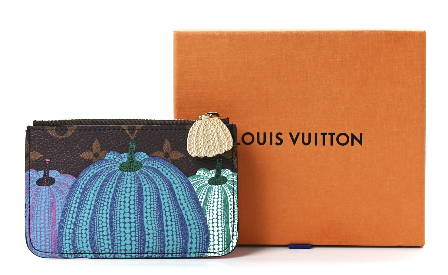
Murakami Multicolore. Yayoi Kusama dots. Stephen Sprouse graffiti. Seasonal illustrations. Special Monograms. Limited prints. Suddenly, a tiny piece of leather or canvas becomes a miniature archive of that collection.
Sometimes I Actually Prefer the Smaller Piece
(Image credit: levelshoes)
This might sound strange coming from someone who loves bags, but there are collaborations where I'd rather own the card case.
Some prints are amazing in small amounts. On a giant tote, they might be too much for me. On a card holder? Perfect. You get the artwork. You get the history. You get the connection to the collection. But you don't have to build an entire outfit around it.
I also think small leather goods can be a nice way to collect several different eras of a brand without ending up with twenty handbags. Not that twenty handbags would necessarily be a problem. But realistically, a card case takes up much less space.
Why Card Cases Became More Useful as Wallets Became Less Necessary
(Image credit: chanel)
There's also a practical reason card cases make so much sense now. A lot of us simply don't carry what we used to. Cash matters less in everyday life for many people. Receipts can be digital. Membership cards live on phones. Payment itself can happen through a phone or watch.
The giant wallet filled with fifteen cards, coins, receipts and random pieces of paper isn't as necessary for everyone anymore. So the card case moved from being the smaller alternative to a wallet to being enough on its own.
I think luxury brands understood that shift very well. And it came at exactly the right time for smaller bags too. Try fitting a huge continental wallet into a mini bag. It's not happening. A card case solves the problem.
The Smallest Luxury Purchase Can Get the Most Use
(Image credit: hermes)
This is another reason I've always thought small leather goods deserve more attention. You might use a card holder more often than your most expensive handbag.
Think about it.
You probably don't carry the same bag every day. You switch depending on the outfit, weather, occasion or how much you need to carry. But your card holder? That can move from bag to bag. Monday it's inside a Neverfull. Tuesday a Puzzle. Wednesday a random canvas tote. Thursday you throw it into your coat pocket because you don't want to carry a bag at all. The object stays with you.
That's a lot of use for something people sometimes treat as the "entry-level" purchase.
And That Means Condition Matters
(Image credit: pinterest)
Card holders get abused. There's no elegant way to say it.
They're constantly touched. Pulled out. Pushed back into bags. Rubbed against other objects. Overfilled. Bent. Dropped. So when I'm looking at one second-hand, I care about different things than I would with a handbag.
Are the card slots stretched? Are the corners heavily rubbed? Has glazing started separating? Is the leather warped? Has the hardware scratched badly? Is the canvas cracking? Are there deep marks from cards being pushed into slots that were already too full? With quilted leather, has the padding flattened? With woven leather, are the edges of the strips still secure?
The smaller the object, the more noticeable some of those details can become.
Buying Second-Hand: Simple Doesn't Mean Easy to Authenticate
(Image credit: pinterest)
A basic card holder might look like an easy thing to authenticate because there aren't many components. Sometimes I think the opposite is true. There are fewer things to inspect. You can't rely on a complicated lock or unusual construction detail if the entire object is two pieces of leather and a few card slots.
So the small details matter. Stitching. Leather quality. Embossing. Logo placement. Hardware. Edge finishing. Pattern alignment where relevant. Interior markings. Construction. And because card holders are relatively accessible compared with handbags, they're also the kind of item people might buy without doing as much research.
I wouldn't. A small luxury item deserves the same attention as a large one.
Which Brand Does the Best Job?
(Image credit: louis vuitton)
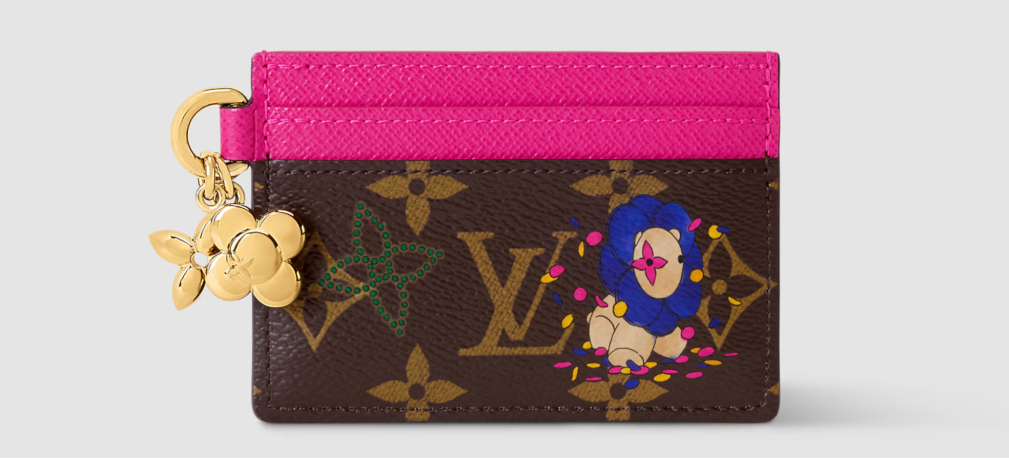
I don't think there's one answer because they're solving completely different design problems. Louis Vuitton shows how powerful a pattern can become. Chanel proves that quilting and a tiny piece of hardware can carry an entire identity. Bottega Veneta shows that craftsmanship itself can become branding. Dior demonstrates how one recognizable line from a handbag can survive in a completely different format. Hermès shows what happens when you remove almost everything and let leather, color and construction speak.
That's what makes comparing them interesting. They all make roughly the same object. A place to put your cards. Yet none of them need to look remotely alike.
The Card Case Is Almost a Brand Test
(Image credit: gucci)
If you really want to know whether a fashion house has a strong identity, shrink it. Take away the runway. Take away the styling. Take away the campaign. Take away the famous handbag silhouette. Give the designer a rectangle barely larger than a credit card.
What happens?
With the strongest luxury houses, the identity survives. Sometimes all it takes is Monogram canvas. A quilted surface. Woven leather. One curved line. A particular shade of leather.
That's why I don't really think of luxury card cases as miniature wallets anymore. They're miniature versions of a brand's design language. And sometimes shrinking that language actually makes it easier to understand. There's nowhere for unnecessary design to hide. You're left with the things the house considers essential. The pattern. The leather. The shape. The hardware. The craftsmanship. The code. All packed into something small enough to disappear into your pocket.
That's what makes them so recognizable.
And for something designed to carry only a few cards, I think that's a lot of fashion history to fit inside.